




A JAPONESQUE CHEF RESTAURANT
-
Architecture & Design
Baranowitz & Goldberg Architects.
A project in collaboration with Pitsou Kedem Architects
-
Architect In Charge
Adi Pecket of Baranowitz & Goldberg Architects
-
Lighting Design
Orly Avron Alkabes
-
Photography
Amit Geron
-
Project Management
- Kanor Project Management
-
Metal Work
- Mano Edrei
-
Carpentry
- Dafni Workshop
-
Contractor
- Moshe Tamam
A is a Japonesque Chef Restaurant located on the second floor of Azrieli-Sarona Tower in Tel Aviv.
The restaurant’s chef, Yuval Ben-Neriah, envisioned it as a culinary institute. It was destined to offer a place to experience rich, timeless knowledge well blended with the chef’s personal interpretation and daring culinary innovations. His idea to fuse Japanese and Western cultures into a slick lively elegance drove us to draw upon classic architectural idioms of form and matter in these two cultures, and re-sculpt them to create a calm yet assertive space and experience.
The entrance is constructed with the idea in mind of Japanese ceremonies and the experience of discovery. As the main entrance to the restaurant is through the tower’s mall, we wished to create an opportunity that allows the guests to leave the hustle & bustle of the crowds behind and focus upon the new experience that lies beyond the door. A curving wall greets A’s guests and gently directs them to the door located at the end of an elongated vestibule.
Upon the passing of the threshold the story of A begins to unfold.
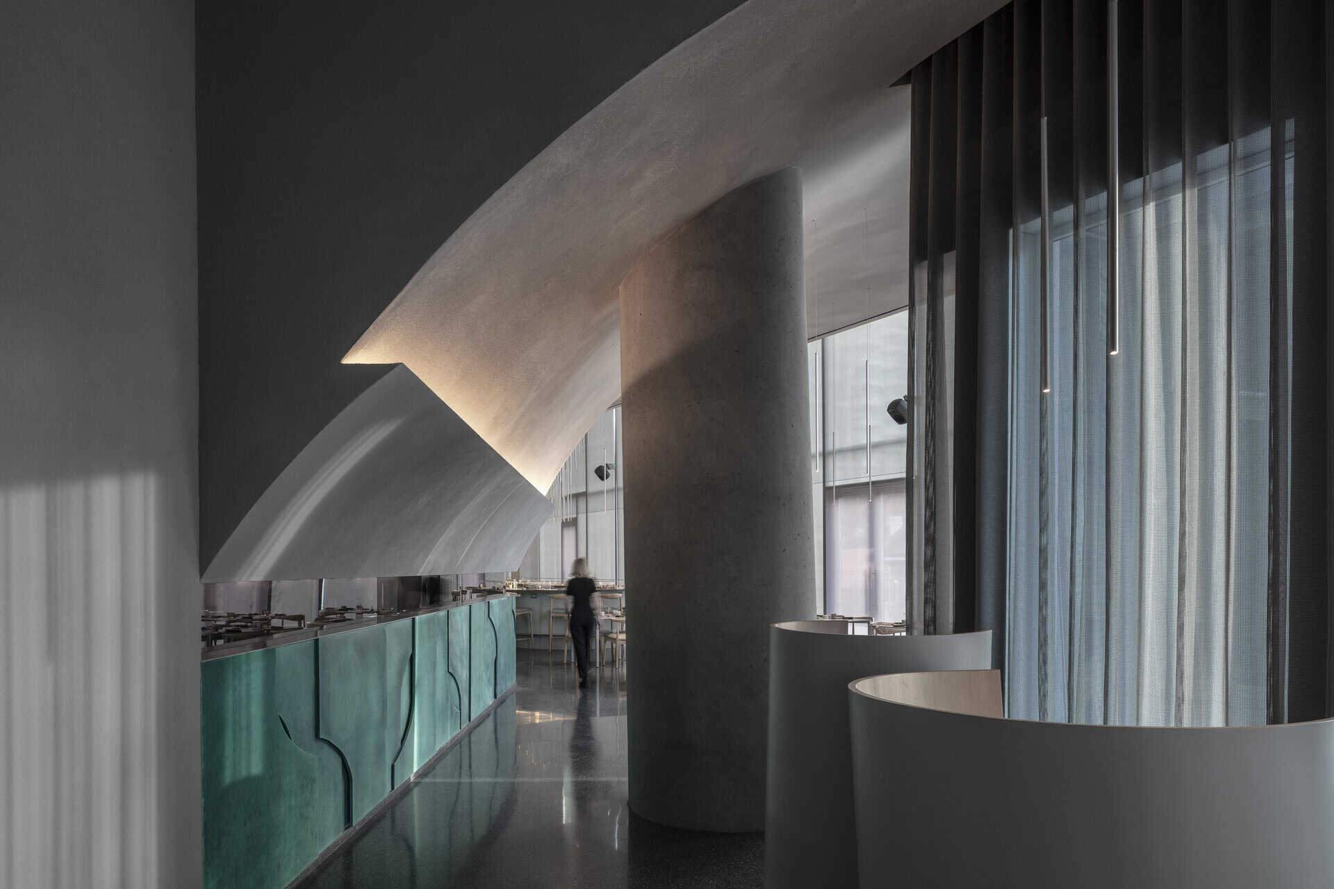
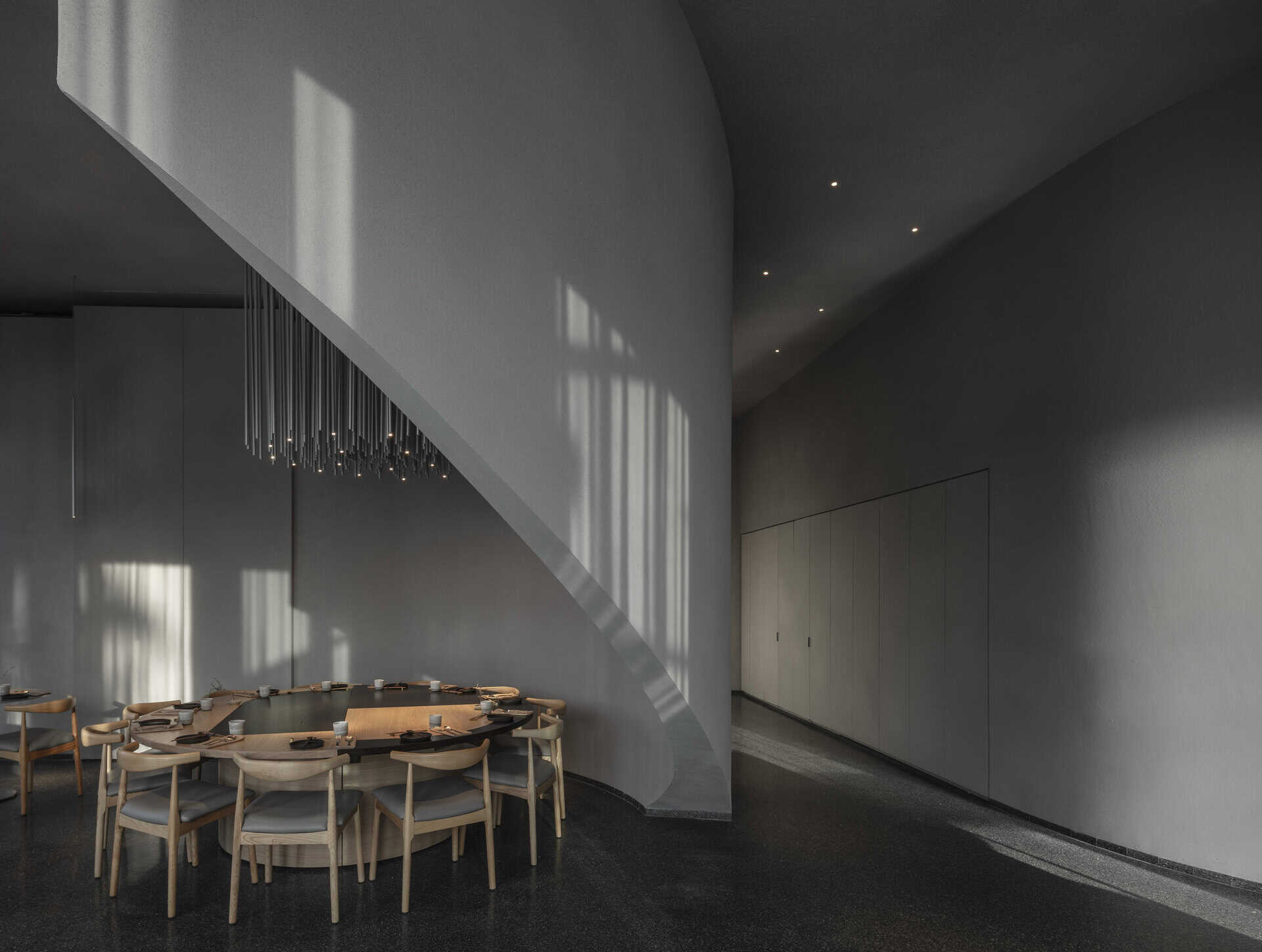
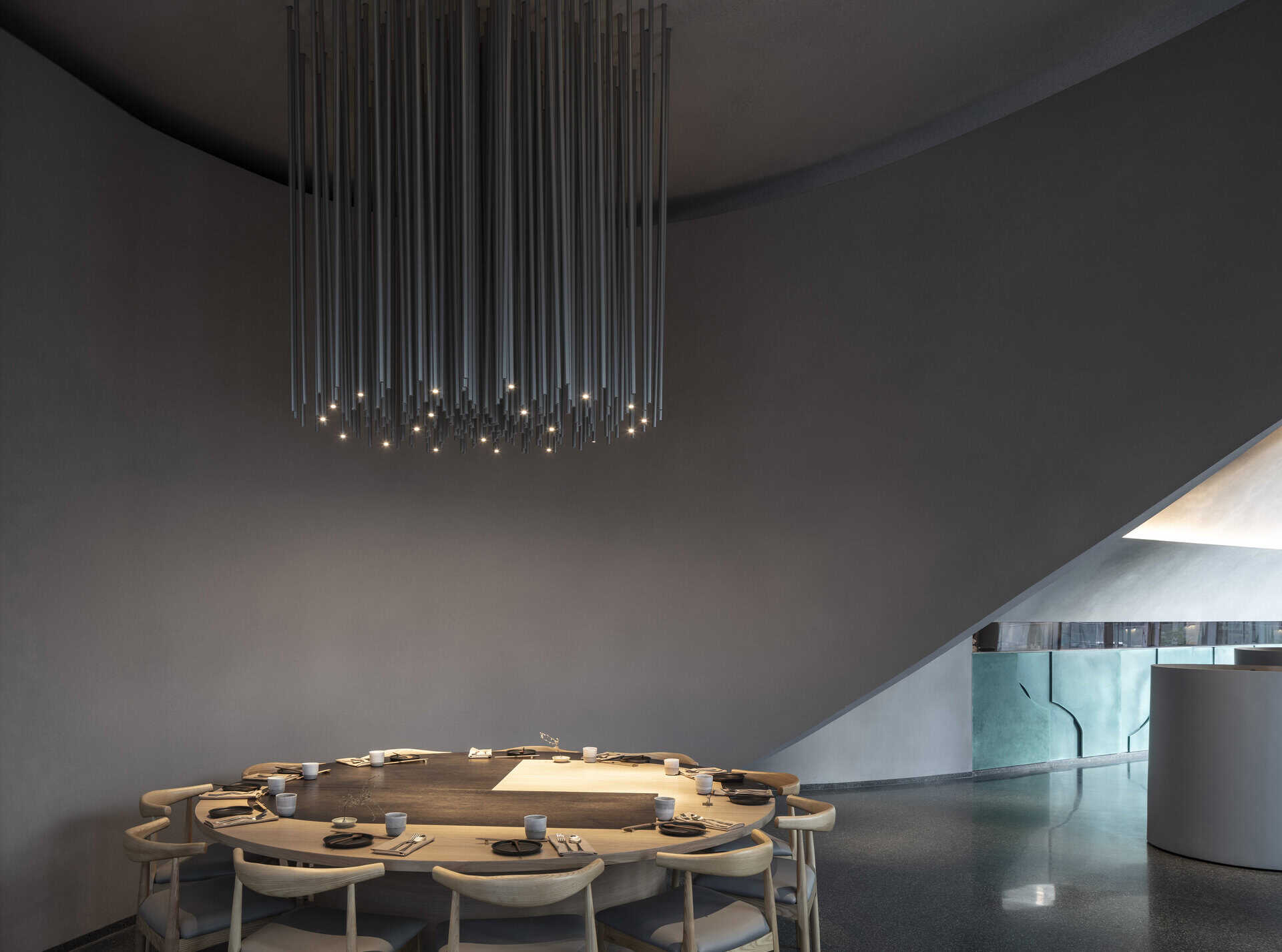
The curving wall is joined by a straight perpendicular wall and together the two lead the guests inwards to be met by the host. At this point the curving wall is detached from the ground and turns to encircle the private seating space, while the visitor is directed to the main dining space, where the view opens and the totality of the architectural gesture is revealed in its fullest.
The straight wall becomes the main architectural feature and assumes the role of defining and
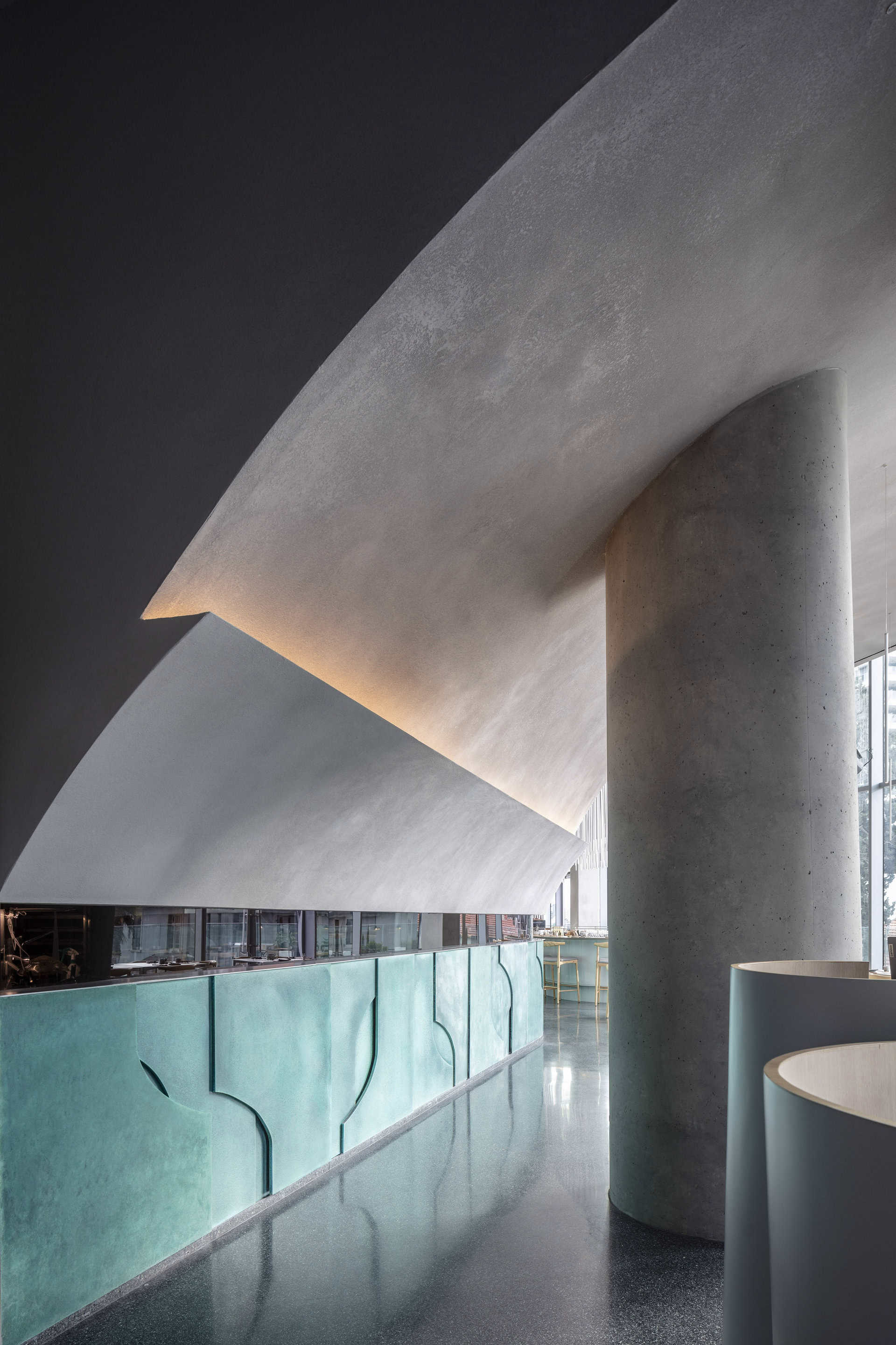
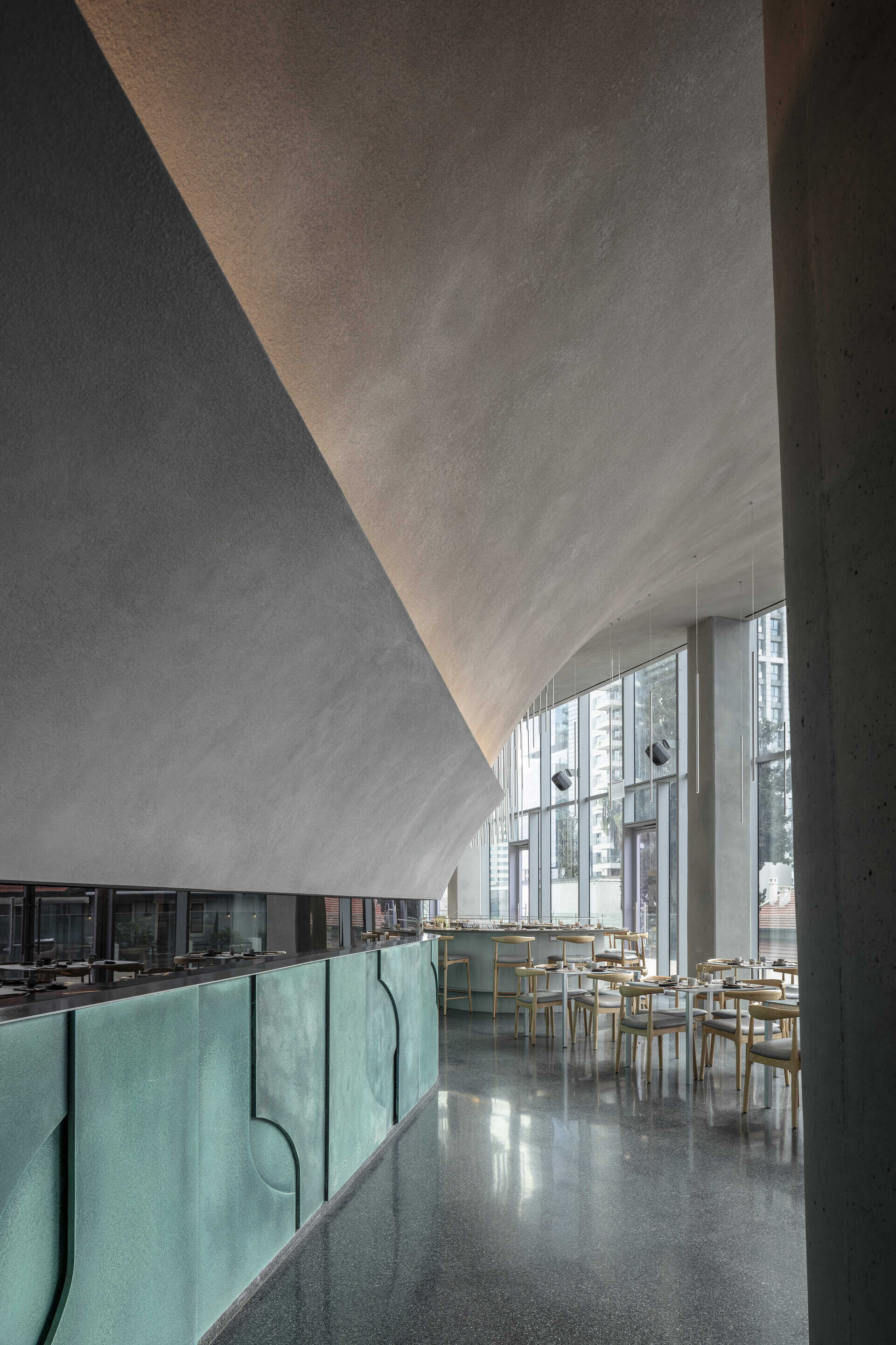
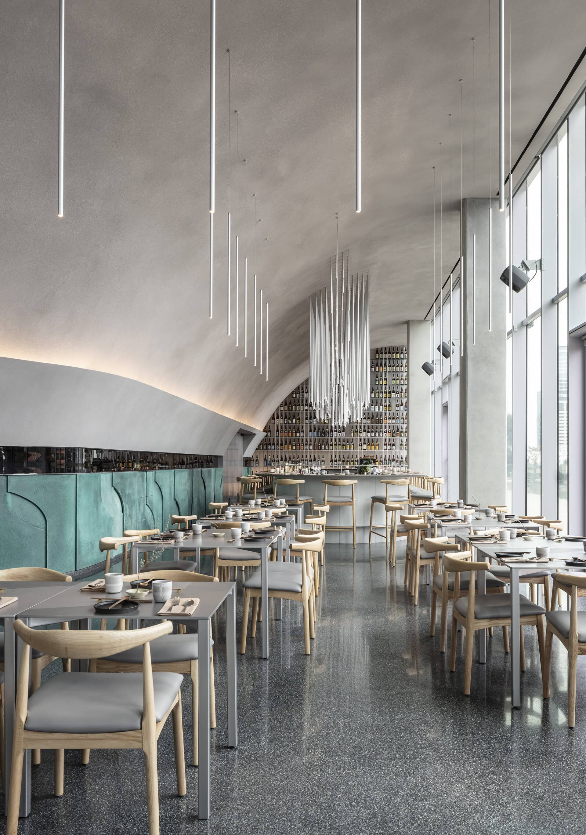
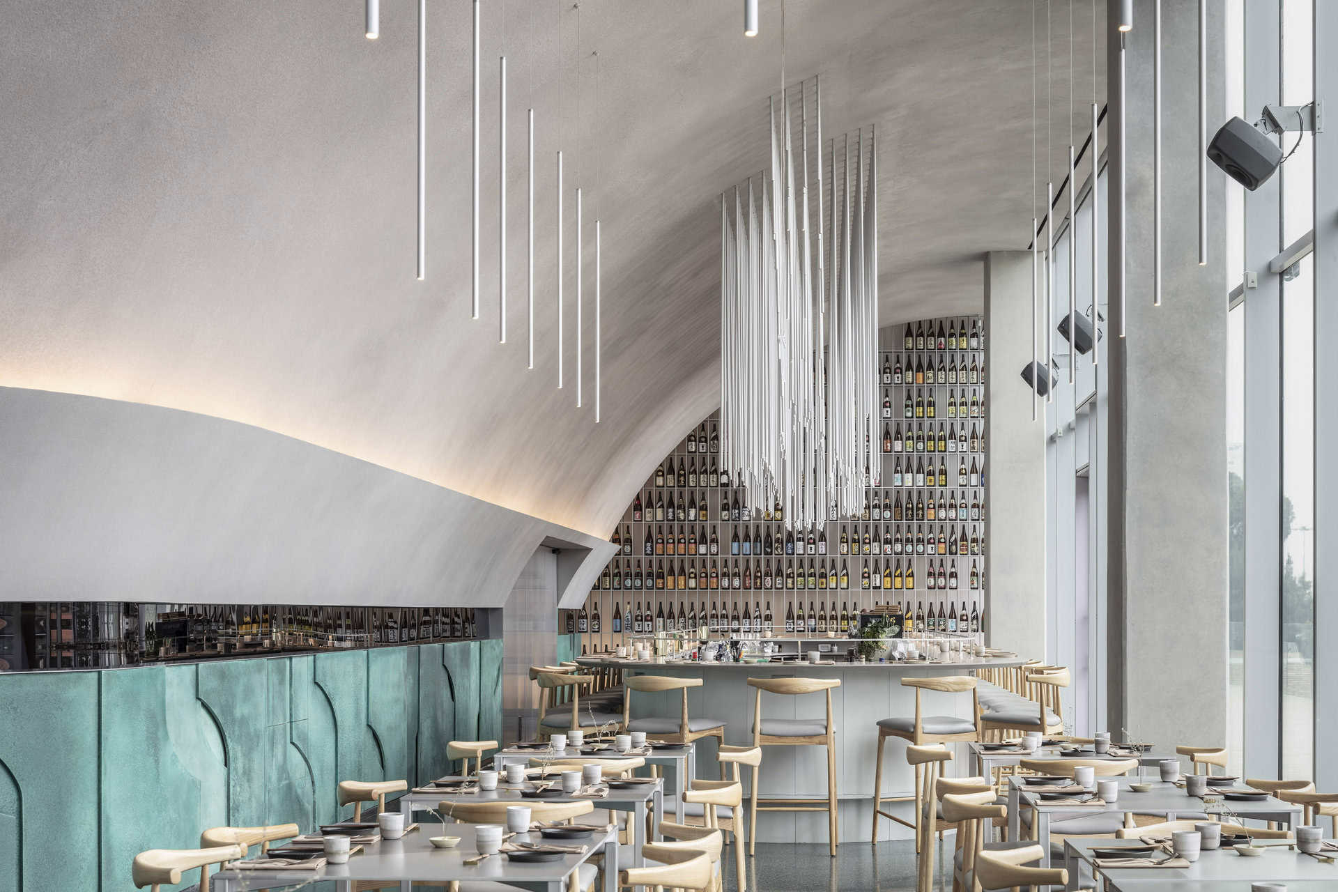
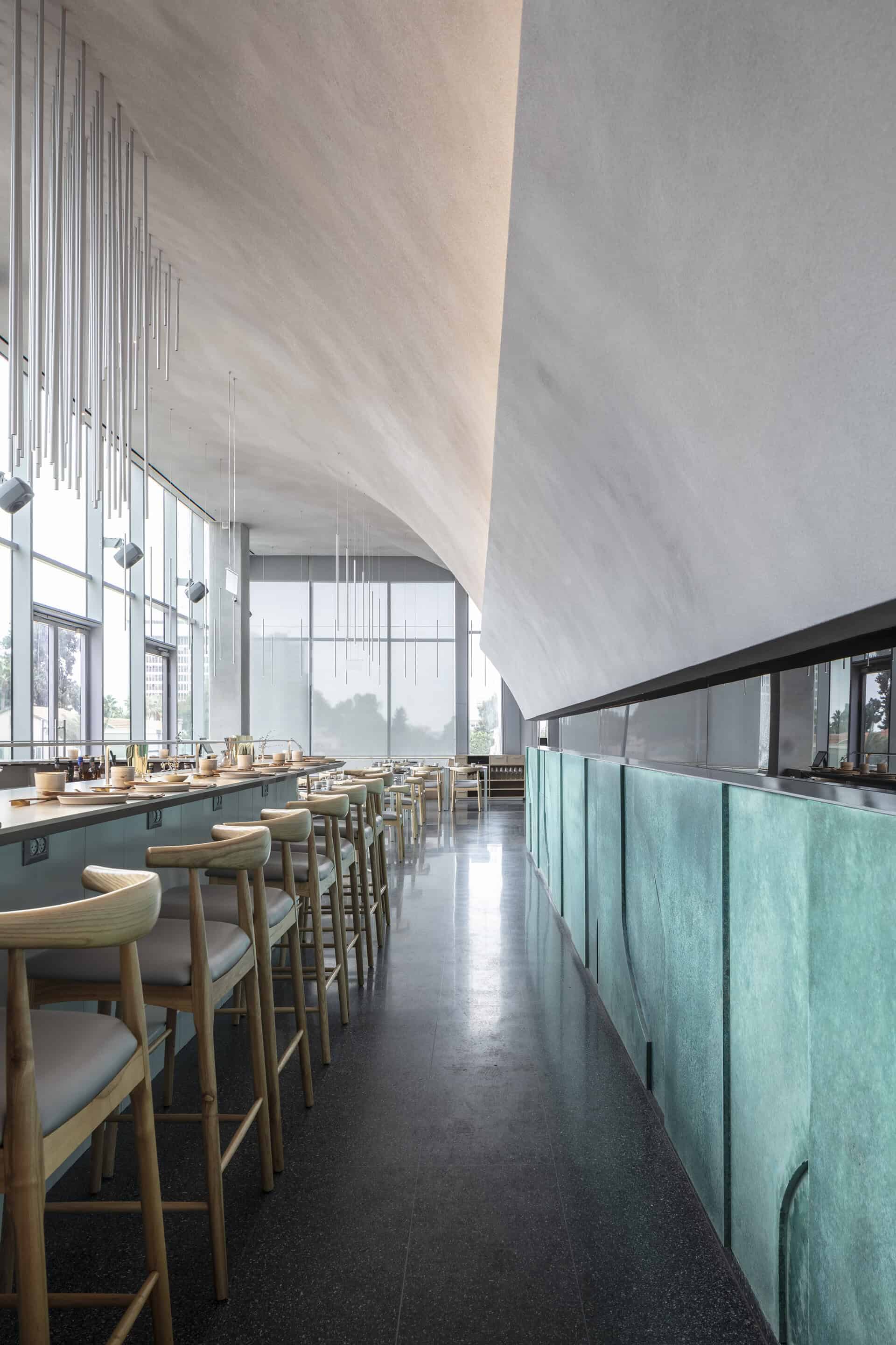
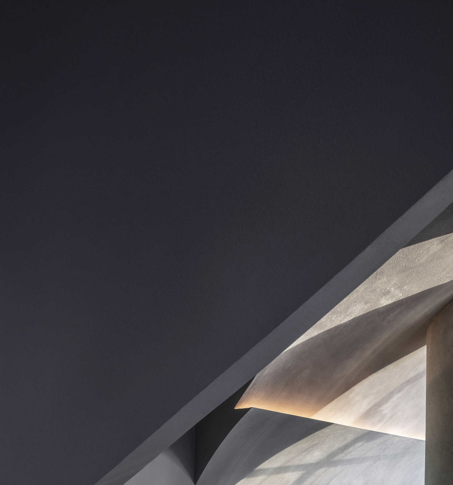
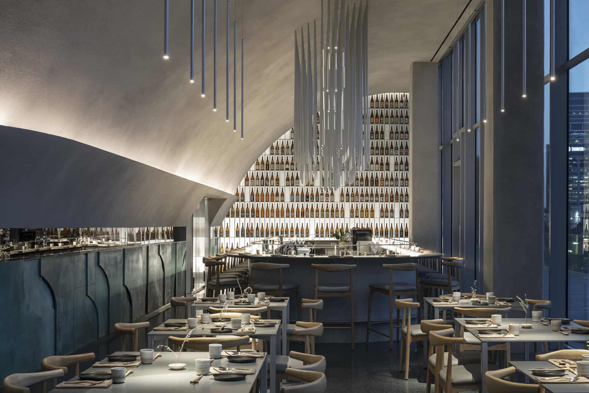
sculpting the main dining hall. It is the partition separating the kitchen from the restaurant and it stretches all along the hall. It is the base of the halved-arch that governs the entire space with one single brush stroke. This classic architectural form was drawn directly from the existing proportions of the given space. Being long, narrow and tall, it evoked the associations of classic colonnades and churches. The fact that a long narrow terrace is stretched all along it, offering a beautiful view of Sarona-Park, made it imperative to direct the view in that direction and establish a strong connection between the indoor and outdoor.
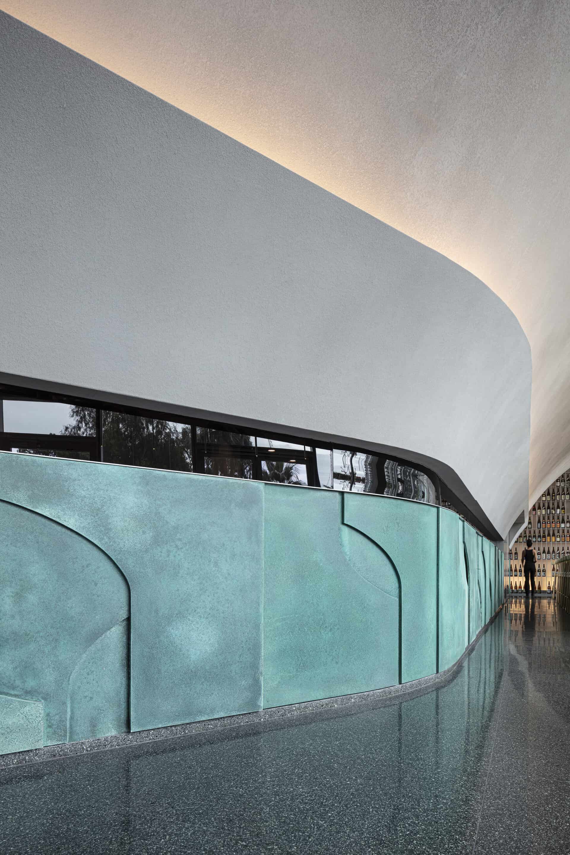
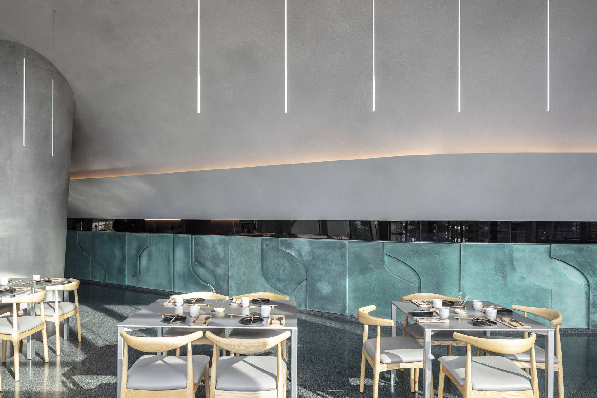
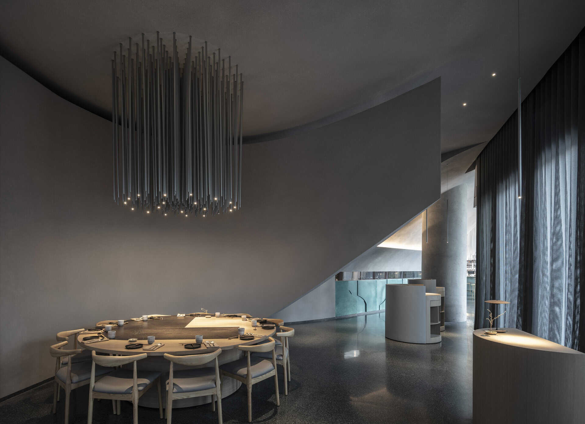
This main partition that defined the dining hall is horizontally divided in three, where each part fulfils a different role: A graphic composition in the language of the half-arch realized in turquoise copper patina cladding embellishes the base of the partition. The patina recalls classic domed edifices and sculptures adorning western cities and elegantly expressing the passage of time. Above this base stretches a long narrow window exposing the industrious activity and the creative culinary force beyond the wall. Above this middle layer the halved-arch juts out to define the experience from above.
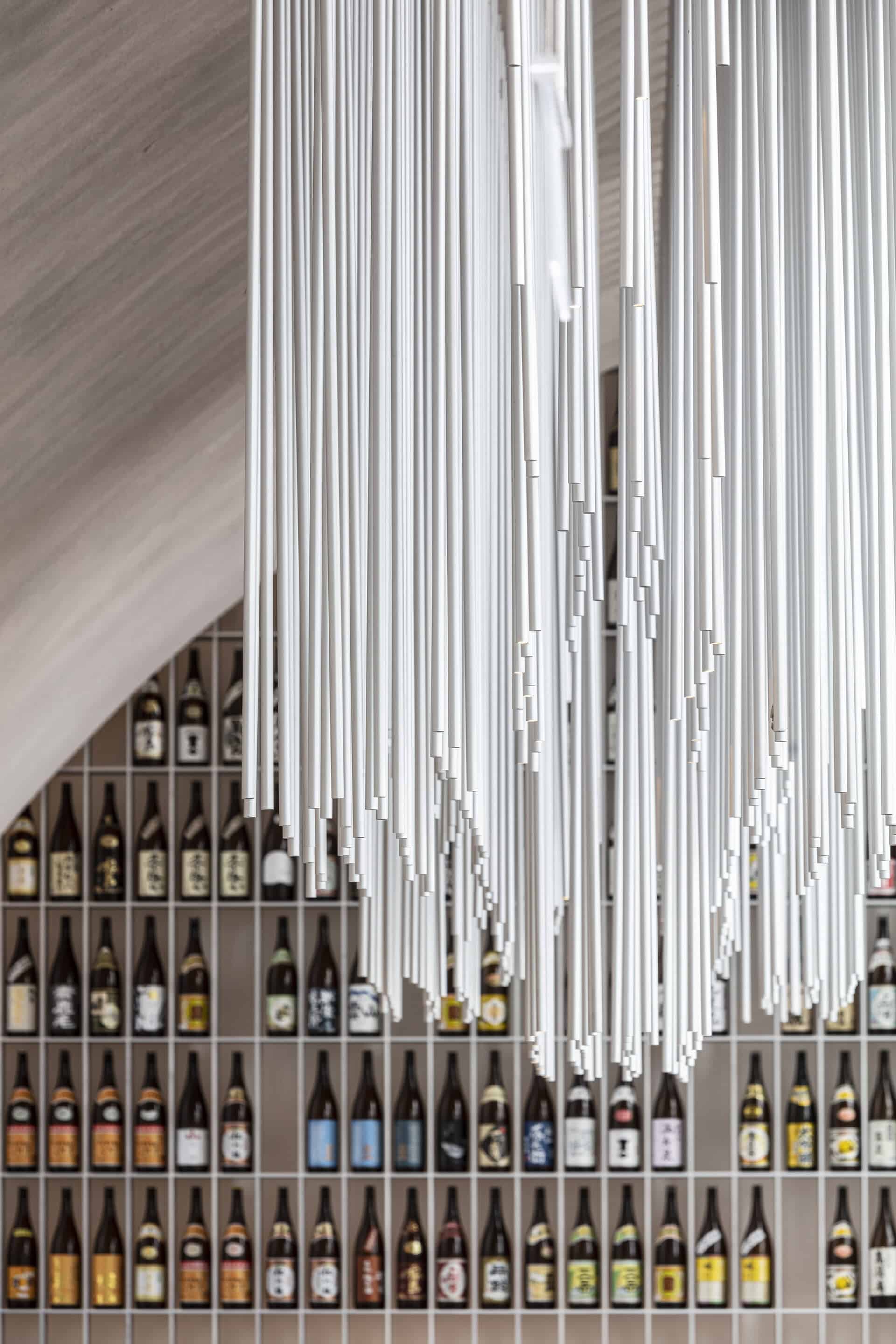
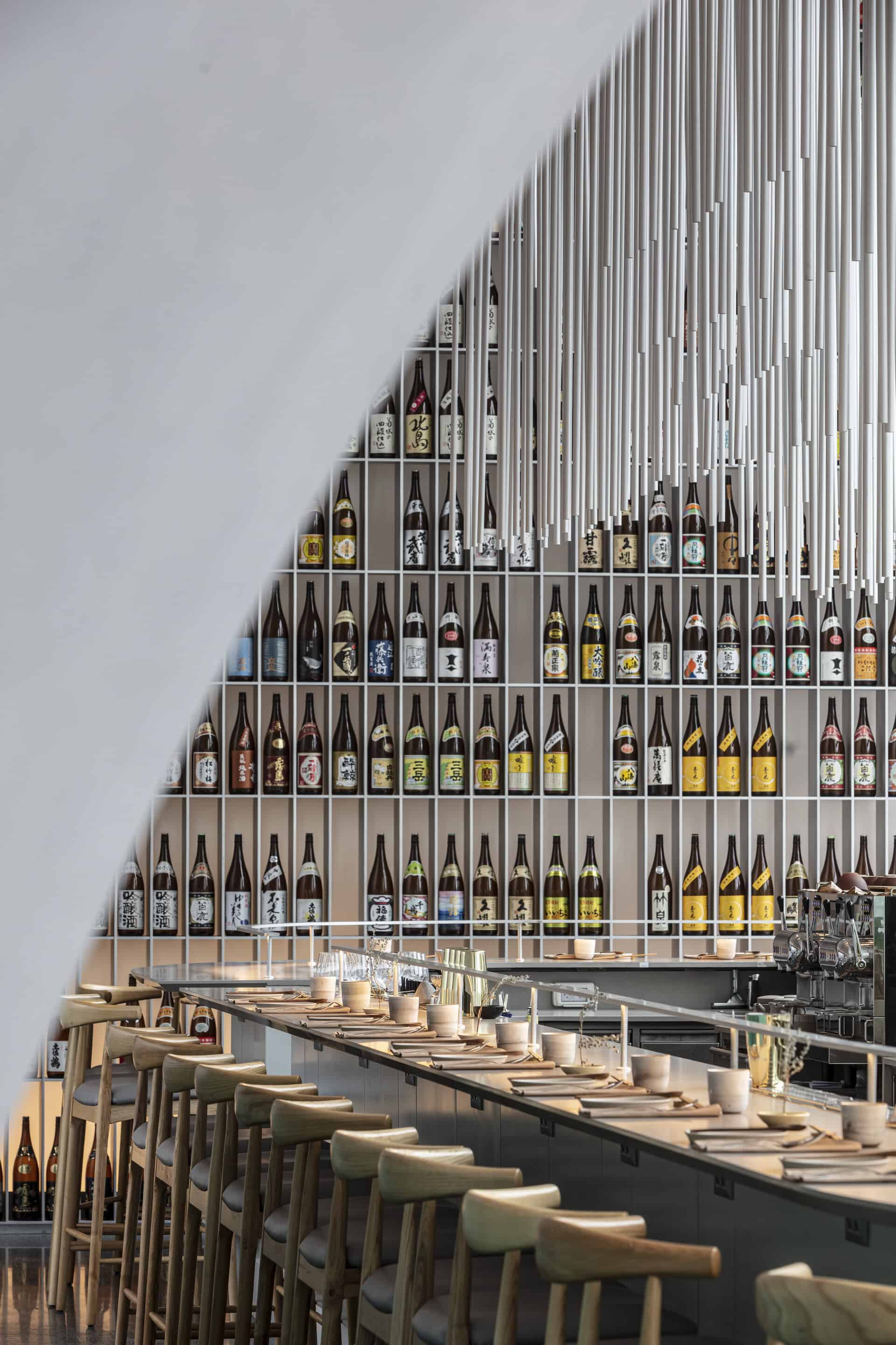
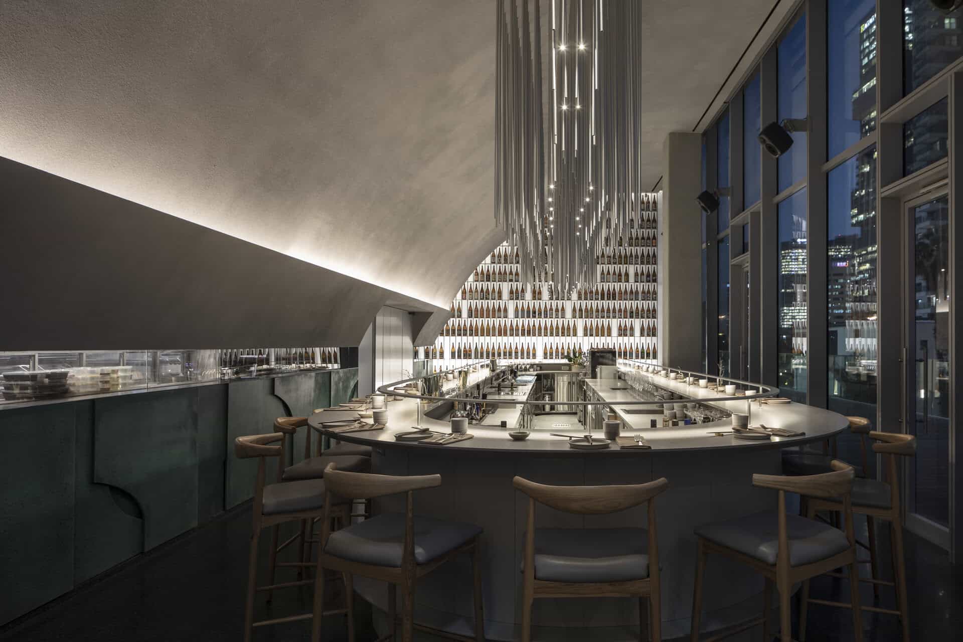
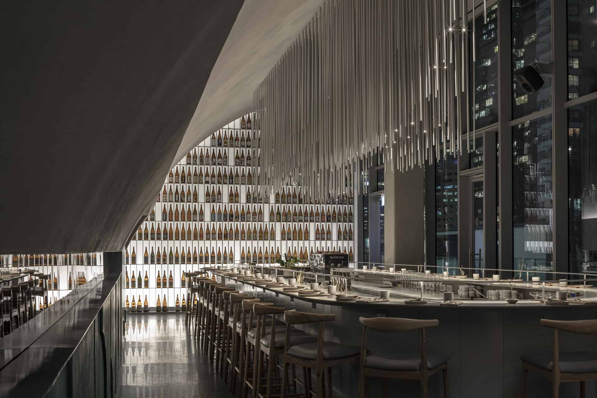
The end of the architectural view culminates in the sake display library, constructed of brushed aluminum which defines the end of the space and functions as the backdrop of the restaurant’s central bar.
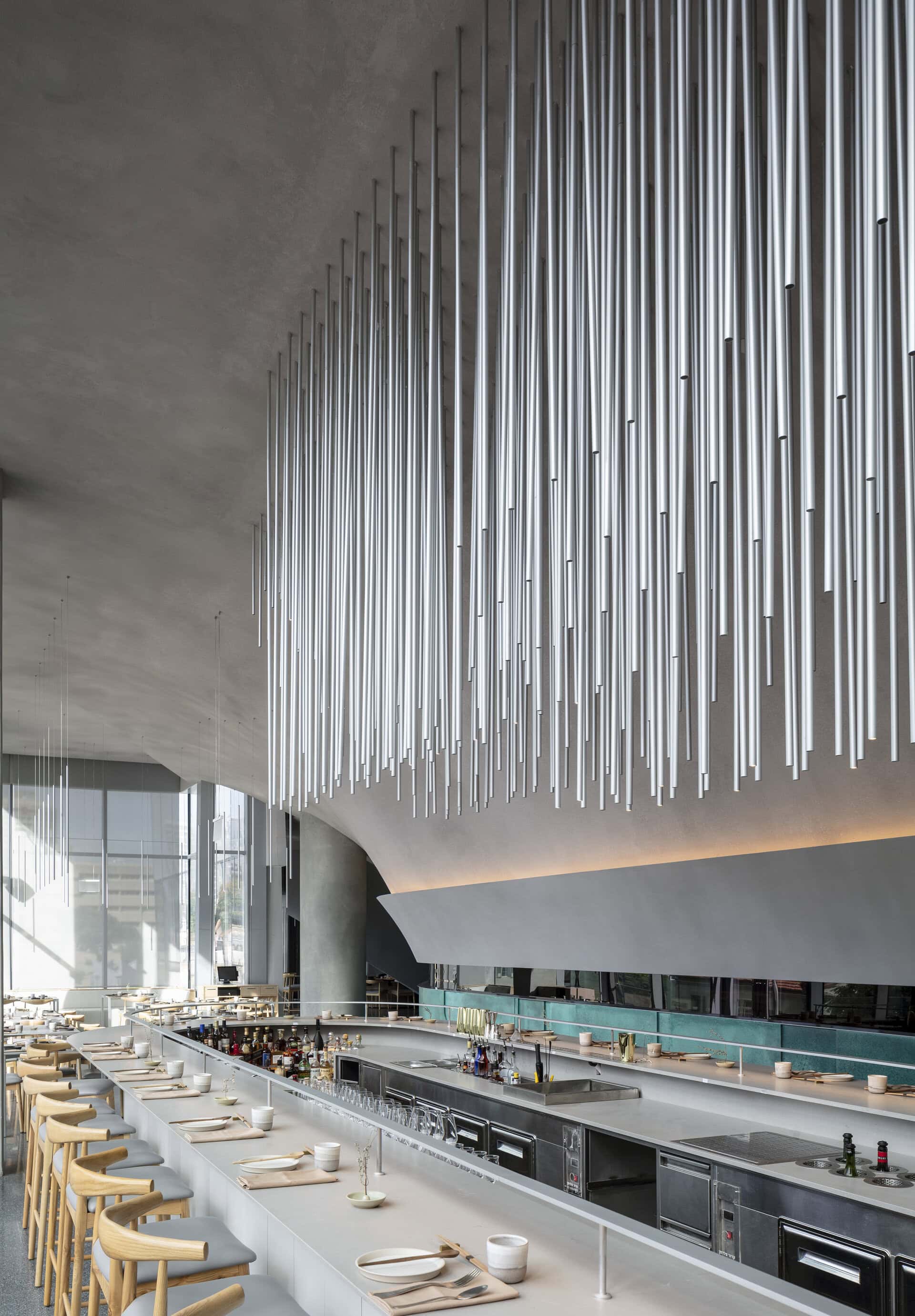
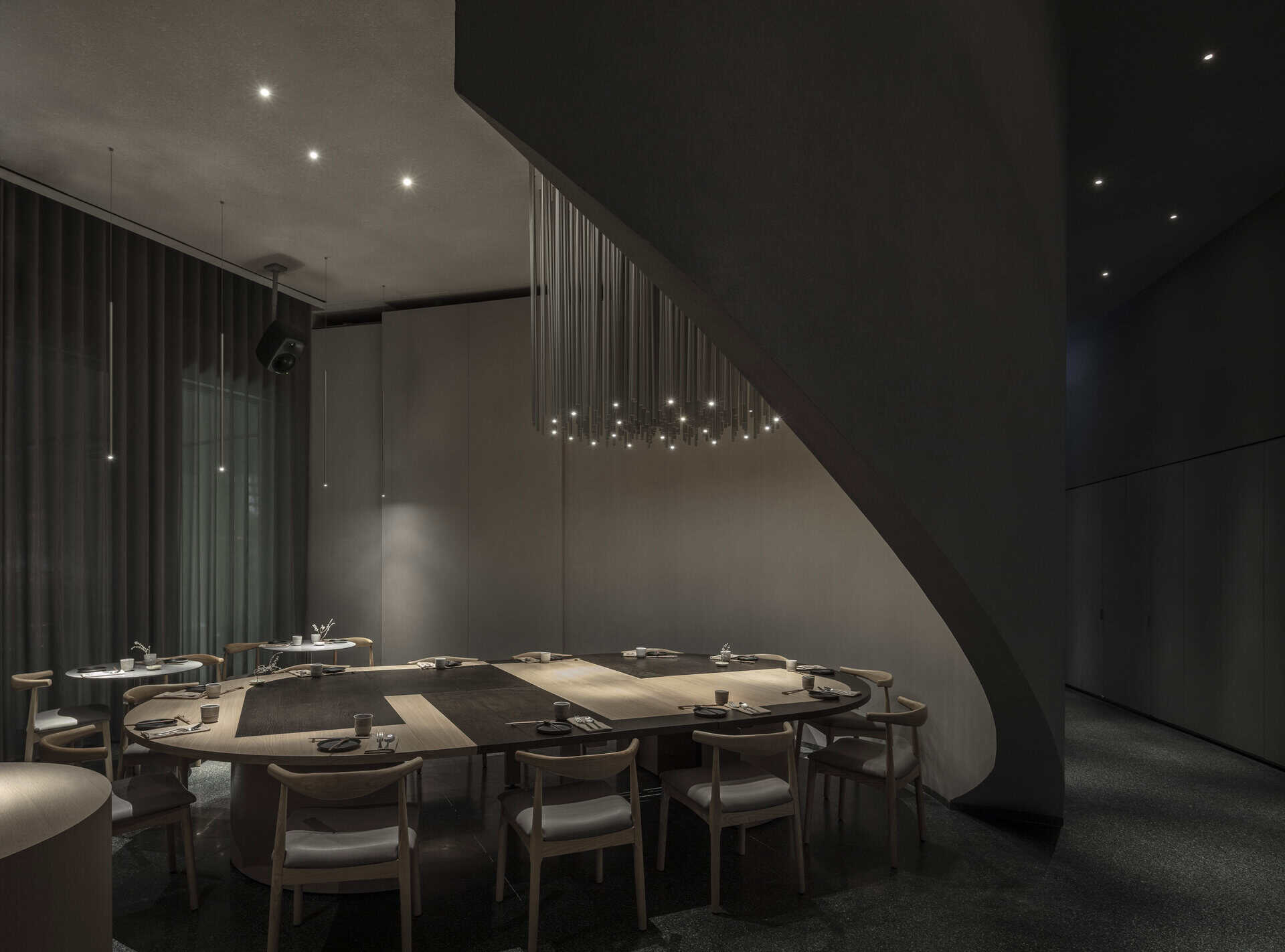
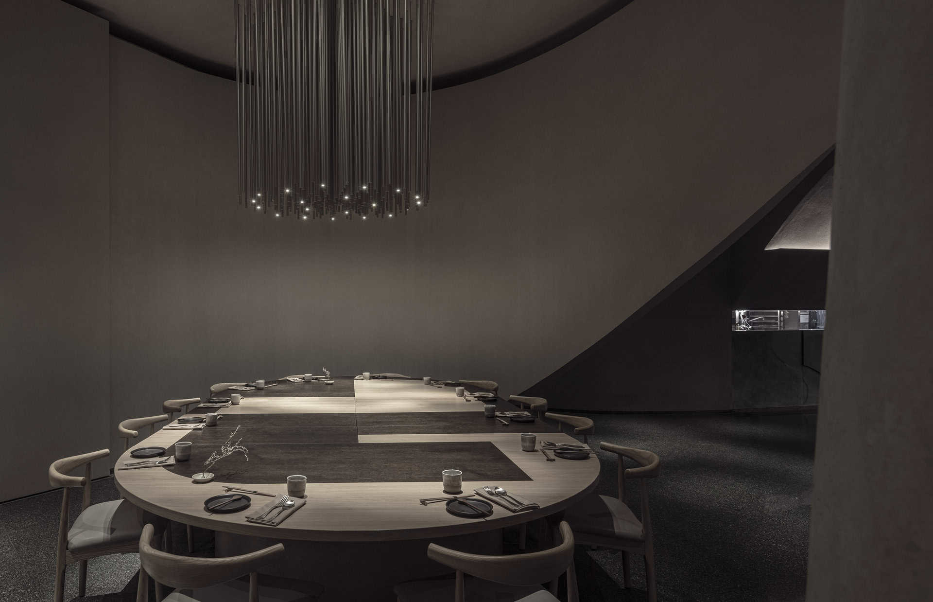
The seating experiences are also conceived as broad gestures and comprise mainly of an elongated bar located in the center of the space. The dining tables are designed in the same language as the patina cladding and are made of aluminum plates in two finishes. The private dining hall enjoys an oversized table for communal seating and can be transformed into an even larger piece that can host up to 20 people.
The lighting of the space is mainly indirect and washes the arch from below, while above the bar and the private space the lighting becomes visible in the form of a modernized version of a chandelier, made of aluminum thin pipes that incorporate little led lights, governing the dining in these areas.
The space is essentially monochromatic in shades of light warm grey and draws its inspiration from modern Japanese architecture that is sculpted in concrete. The copper patina and wood of the dining chairs endow the space with accents of color, and the terrazzo grey floor introduces sprinkle of green and recalls European materiality while also referencing local Israeli heritage.
A is essentially a delightful expression of a modernist interpretation served on a plate of classic inspiration.


